 Hameedia · Sri Lanka · 2024Fig. 06 · Brand Identity · 2024 — Live Brief
Hameedia- Rebrand.
Hameedia · Sri Lanka · 2024Fig. 06 · Brand Identity · 2024 — Live BriefHameedia- Rebrand.
A rebrand of Hameedia — Sri Lanka's oldest menswear house, opened in 1949 in Colombo's Pettah district as a single tailoring counter, today eighteen retail stores and three private-label houses. The new identity replaces a busy wordmark, two checkered flags, and a typewriter tagline with a single pixelated H that absorbs the chequered flag motif into the letter itself.
The brief was not to reposition the house away from its history — it was to translate it. Keep the things that earned the loyalty. Replace the things that no longer carried weight. The new identity had to read as Hameedia at a glance, and as something built in this decade when held in the hand.
A rebrand of Hameedia — Sri Lanka's oldest menswear house, opened in 1949 in Colombo's Pettah district as a single tailoring counter, today eighteen retail stores and three private-label houses. The new identity replaces a busy wordmark, two checkered flags, and a typewriter tagline with a single pixelated H that absorbs the chequered flag motif into the letter itself.
The brief was not to reposition the house away from its history — it was to translate it. Keep the things that earned the loyalty. Replace the things that no longer carried weight. The new identity had to read as Hameedia at a glance, and as something built in this decade when held in the hand.
How do you carry 75 years of tailoring forward without printing the year on it?
How do you carry 75 years of tailoring forward without printing the year on it?
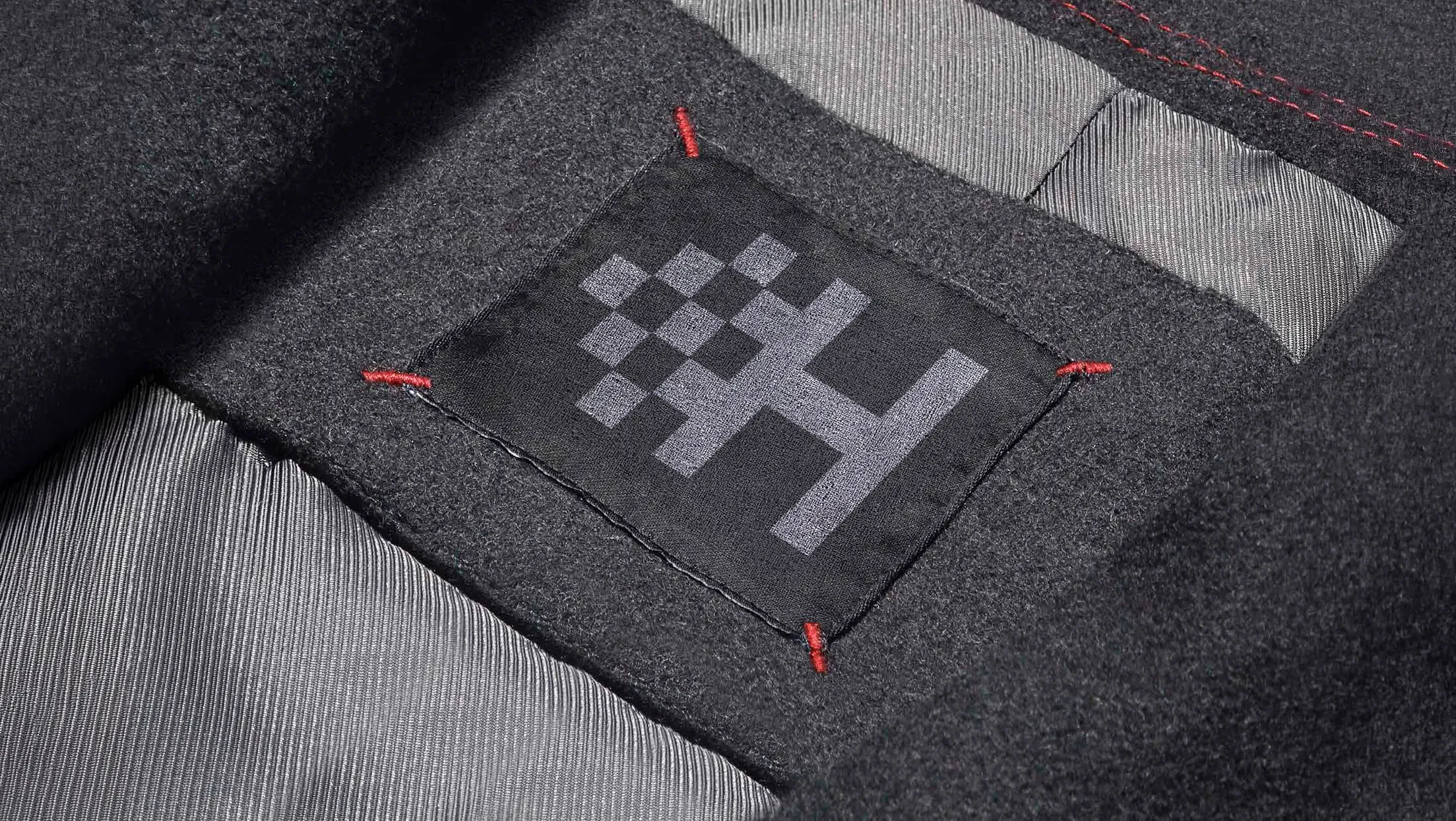
The original mark held a sketch, a flag, a wordmark and a tagline in one composition. The new mark is one shape: a pixelated H on an 8×5 grid that doubles as the chequered flag motif.
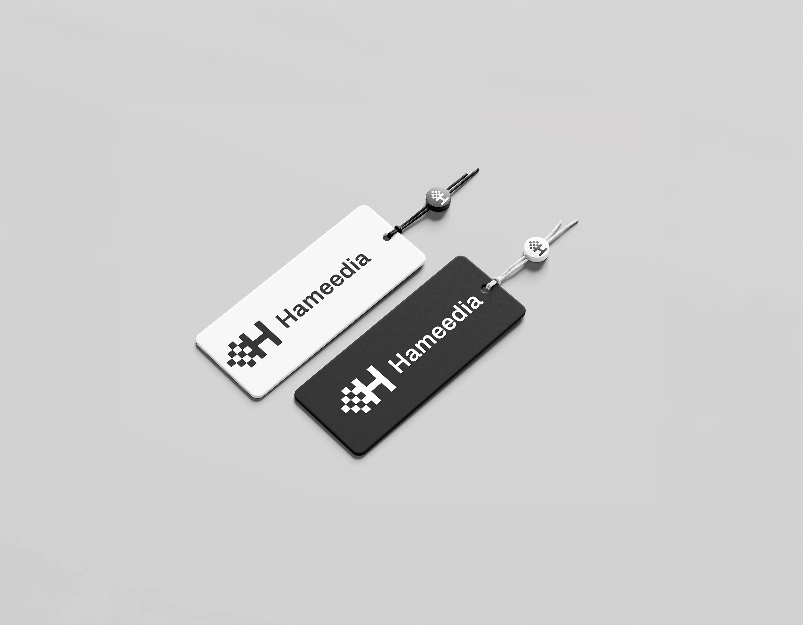
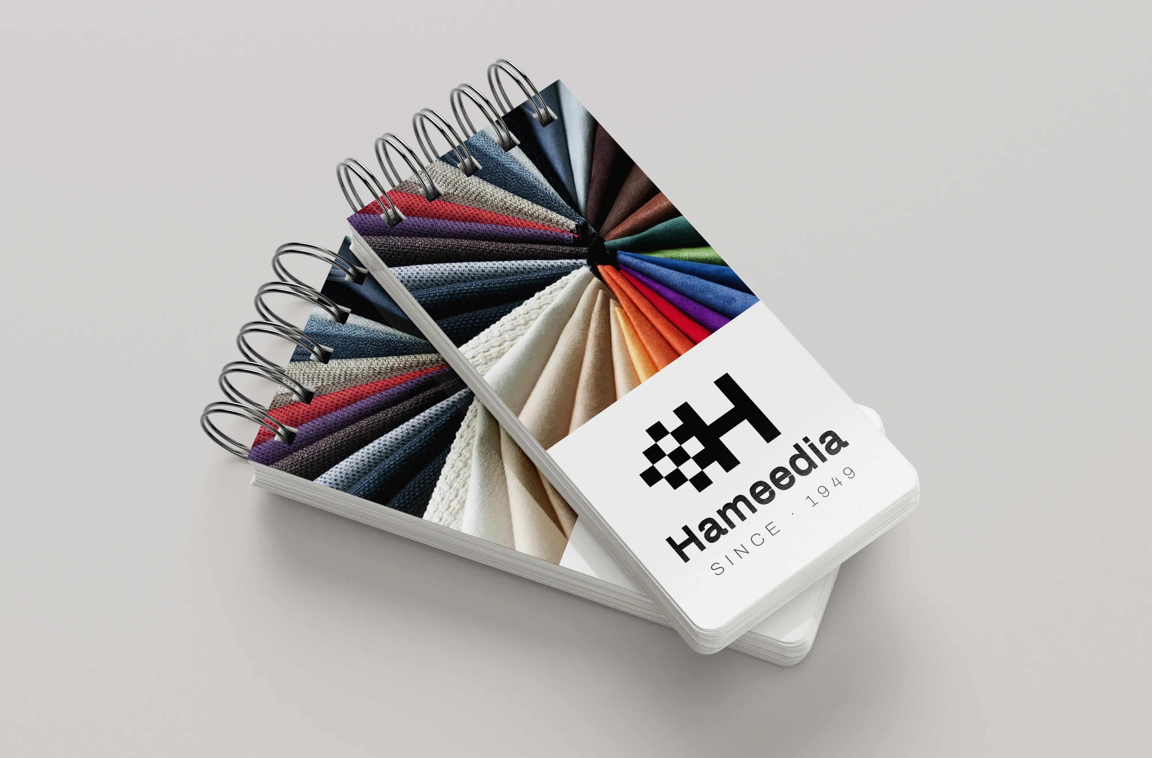
A symbol that works at 12mm on a woven label and at 9m on a building elevation, with the same number of pixels. Consistency across print, packaging, retail, and digital — without redrawing anything.
The chequered flag from the original logo is the carrier of the brand's history — borrowed from Sri Lankan craftsmanship and weaving repetition. The new H absorbs it, instead of standing next to it.
The original mark held a sketch, a flag, a wordmark and a tagline in one composition. The new mark is one shape: a pixelated H on an 8×5 grid that doubles as the chequered flag motif.
A symbol that works at 12mm on a woven label and at 9m on a building elevation, with the same number of pixels. Consistency across print, packaging, retail, and digital — without redrawing anything.
The chequered flag from the original logo is the carrier of the brand's history — borrowed from Sri Lankan craftsmanship and weaving repetition. The new H absorbs it, instead of standing next to it.
Hameedia is one of Sri Lanka's oldest menswear houses — opened in 1949 in Colombo's Pettah district as a single tailoring counter, today eighteen retail stores and three private-label houses. The brand is known; it's also seen, by a generation younger than its founders, as the place their father bought his shirts from.
The brief was not to reposition the house away from that history. It was to translate it. Keep the things that earned the loyalty (precision tailoring, the chequered flag, the wordmark in block capitals); replace the things that no longer carried weight. The new identity had to read as Hameedia at a glance — and as something built in this decade, when held in the hand.
Hameedia is one of Sri Lanka's oldest menswear houses — opened in 1949 in Colombo's Pettah district as a single tailoring counter, today eighteen retail stores and three private-label houses. The brand is known; it's also seen, by a generation younger than its founders, as the place their father bought his shirts from.
The brief was not to reposition the house away from that history. It was to translate it. Keep the things that earned the loyalty (precision tailoring, the chequered flag, the wordmark in block capitals); replace the things that no longer carried weight. The new identity had to read as Hameedia at a glance — and as something built in this decade, when held in the hand.
The old identity carried its history with it — a busy wordmark, two checkered flags, a tagline set in a typewriter face. The rebrand had to keep the line that runs through all of it (precision, repetition, the chess-board) and lose the noise around it.
The chequered flag was the asset; the wordmark was the cost. A single mark is more honest than three lockups. Heritage is shown by how it's made, not by writing the year on it.
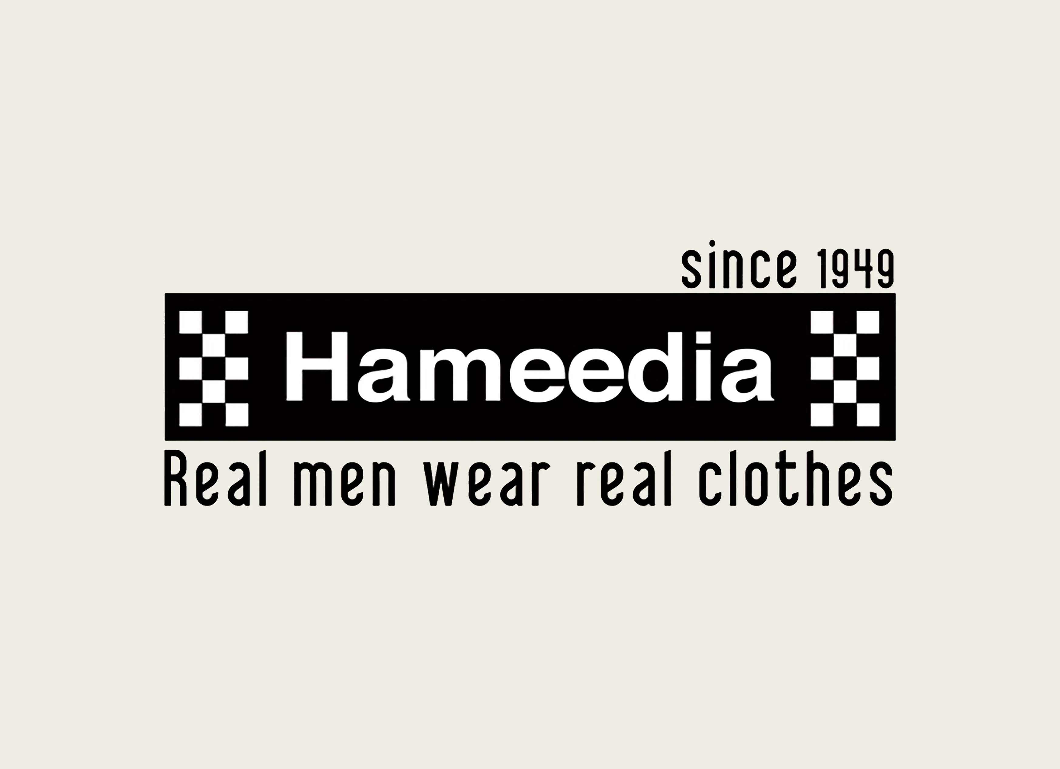
The old identity carried its history with it — a busy wordmark, two checkered flags, a tagline set in a typewriter face. The rebrand had to keep the line that runs through all of it (precision, repetition, the chess-board) and lose the noise around it.
The chequered flag was the asset; the wordmark was the cost. A single mark is more honest than three lockups. Heritage is shown by how it's made, not by writing the year on it.
The checker pattern is the brand's DNA. Preserve it, simplify everything else.
The original Hameedia identity had accumulated layers over decades — a sketched motif, two checkered flags, a wordmark, and a typewriter tagline all competing for attention. But buried inside that noise was the one element that actually carried the brand's history: the chequered flag, borrowed from Sri Lankan weaving tradition. The insight was to stop treating it as decoration and start treating it as structure — fold the flag into the letter itself.
The chequered flag was the asset. Everything else was cost.
The checker pattern is the brand's DNA. Preserve it, simplify everything else.
The original Hameedia identity had accumulated layers over decades — a sketched motif, two checkered flags, a wordmark, and a typewriter tagline all competing for attention. But buried inside that noise was the one element that actually carried the brand's history: the chequered flag, borrowed from Sri Lankan weaving tradition. The insight was to stop treating it as decoration and start treating it as structure — fold the flag into the letter itself.
The chequered flag was the asset. Everything else was cost.
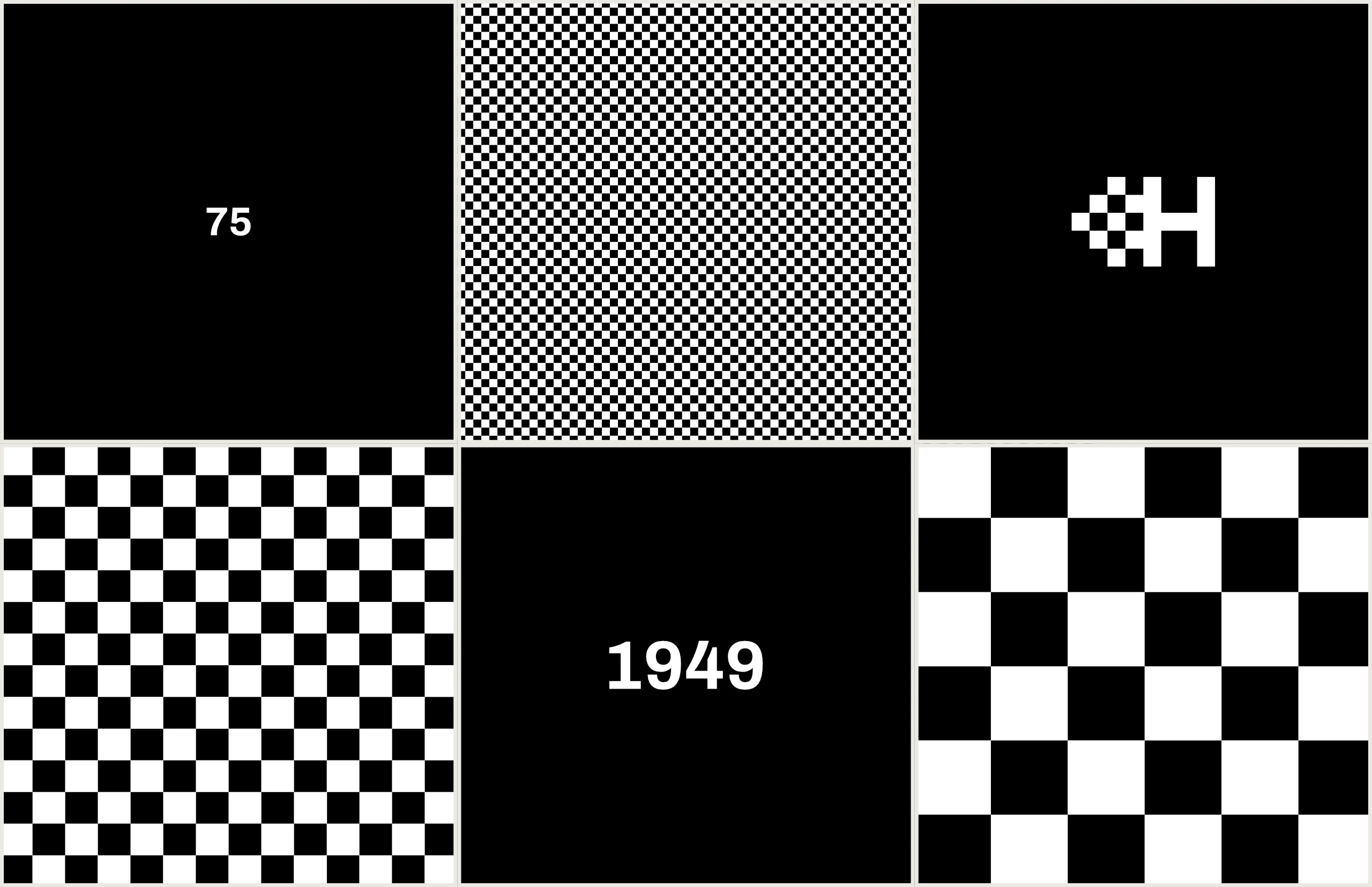
The mark is built on an 8-column × 5-row grid of equal squares. The right half is the letter H — a left and right vertical, joined by a single crossbar pixel at the middle row. The left half is the chequered flag from the original identity, redrawn on the same grid so it cascades into the letter rather than sitting beside it.
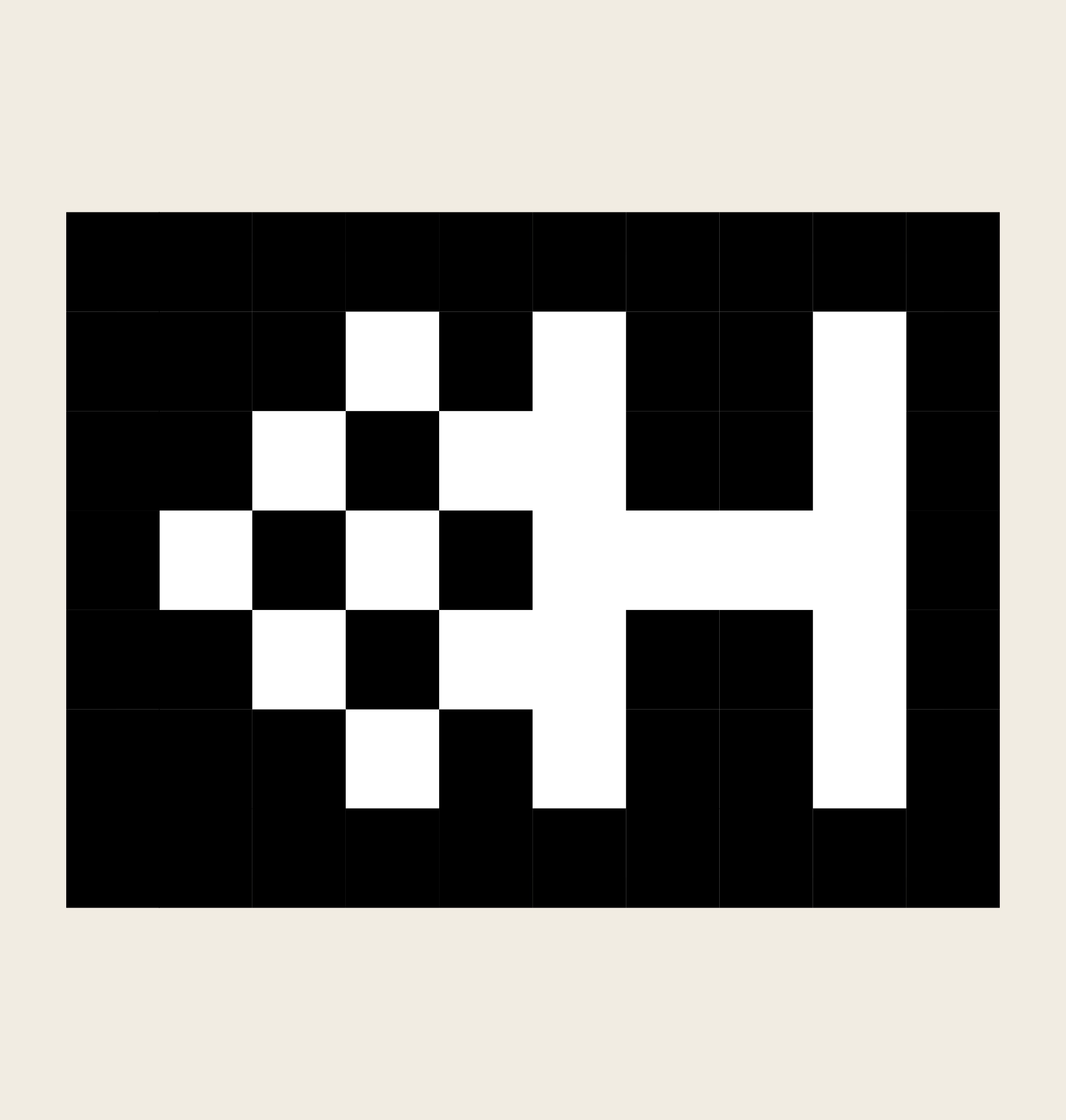
The mark is built on an 8-column × 5-row grid of equal squares. The right half is the letter H — a left and right vertical, joined by a single crossbar pixel at the middle row. The left half is the chequered flag from the original identity, redrawn on the same grid so it cascades into the letter rather than sitting beside it.
Four lockups derived from a single grid — symbol, horizontal, vertical, and reverse.

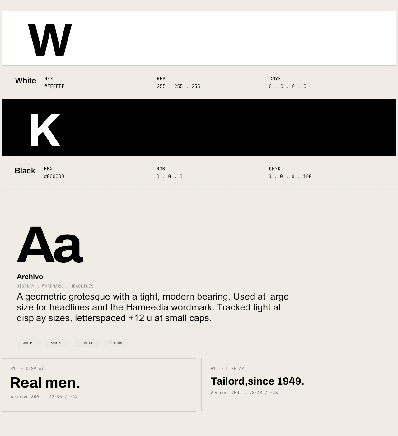
Four lockups derived from a single grid — symbol, horizontal, vertical, and reverse.
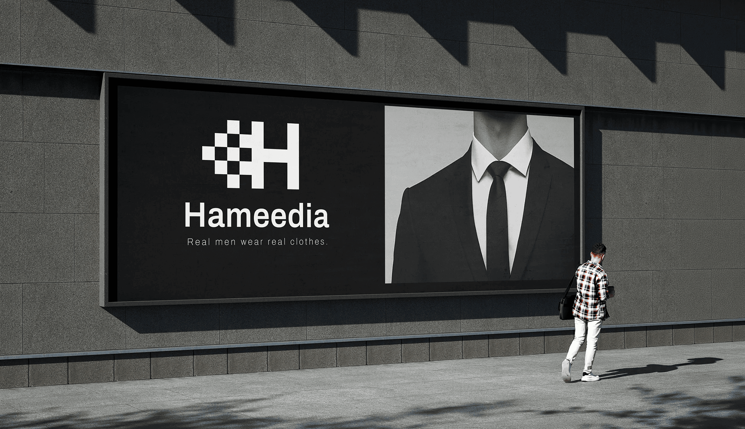
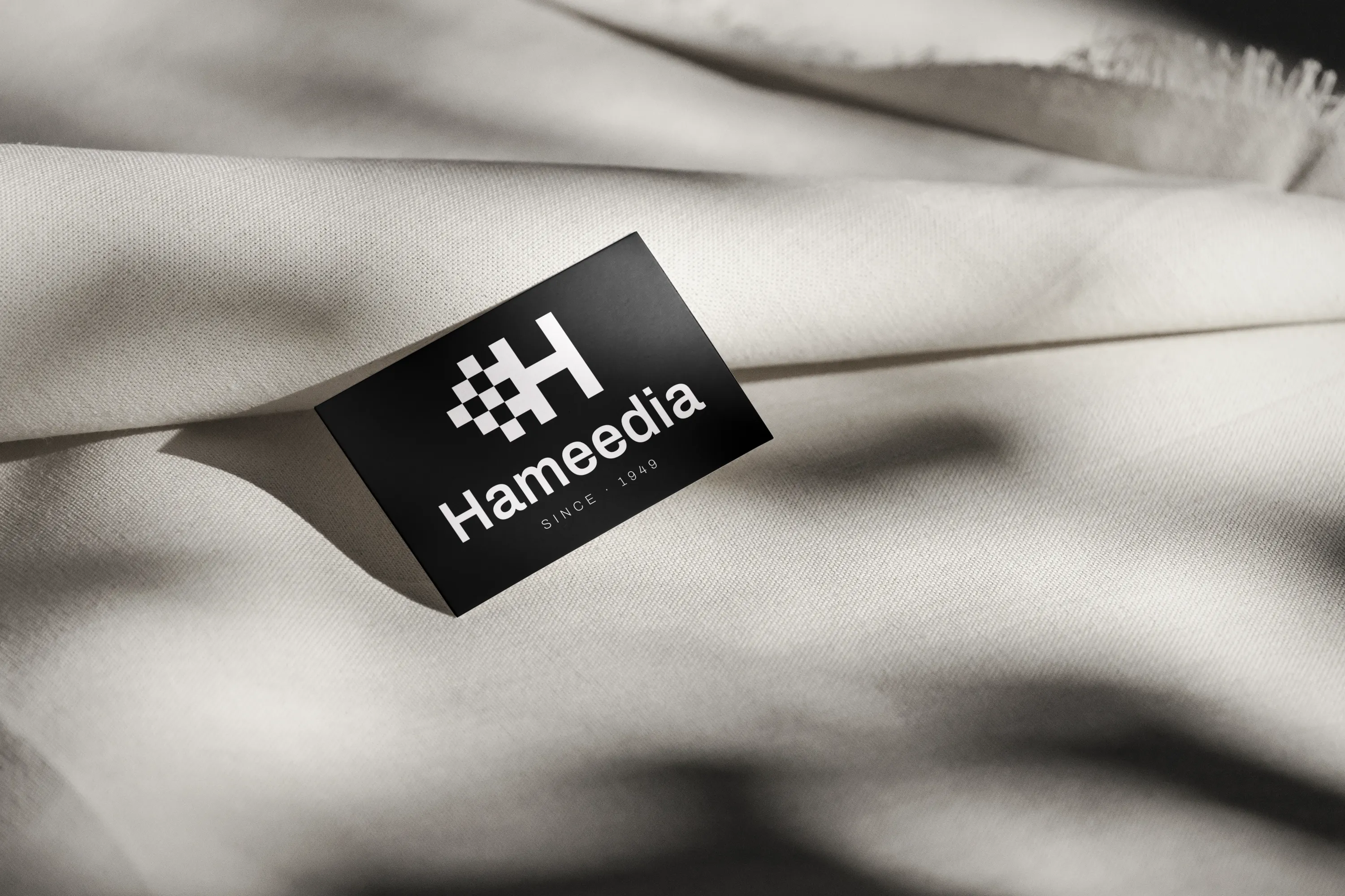



The mark carried the weight.
The mark carried the weight.
The brief was set by a lecturer who was handling the actual Hameedia project. The rebrand was commissioned to a different agency — my work was a parallel design response, not the delivered outcome. What validated the thinking was what happened after: the sketch logo from this project appeared in the actual Hameedia rebrand. Not as a copy, but as confirmation that starting from the same place — the checker pattern as the brand's structural DNA — leads to the same answer. Given a real brief with no sight of what the agency was producing, the instinct was right. That's a more useful proof than a delivered project.
Build a motion identity.
The cascading flag pixels are a sequence — a six-frame loop where the checker pixels fall into the H. Reserve it for the app splash and store-window screens. Compress the type system to a single variable font across web and packaging. Build sub-brand architecture for the three private-label houses. And draw the Sinhala and Tamil wordmarks on the same grid with parity, not transliteration.
The mark carried the weight.
The mark carried the weight.
The brief was set by a lecturer who was handling the actual Hameedia project. The rebrand was commissioned to a different agency — my work was a parallel design response, not the delivered outcome. What validated the thinking was what happened after: the sketch logo from this project appeared in the actual Hameedia rebrand. Not as a copy, but as confirmation that starting from the same place — the checker pattern as the brand's structural DNA — leads to the same answer. Given a real brief with no sight of what the agency was producing, the instinct was right. That's a more useful proof than a delivered project.
Build a motion identity.
The cascading flag pixels are a sequence — a six-frame loop where the checker pixels fall into the H. Reserve it for the app splash and store-window screens. Compress the type system to a single variable font across web and packaging. Build sub-brand architecture for the three private-label houses. And draw the Sinhala and Tamil wordmarks on the same grid with parity, not transliteration.